Uber
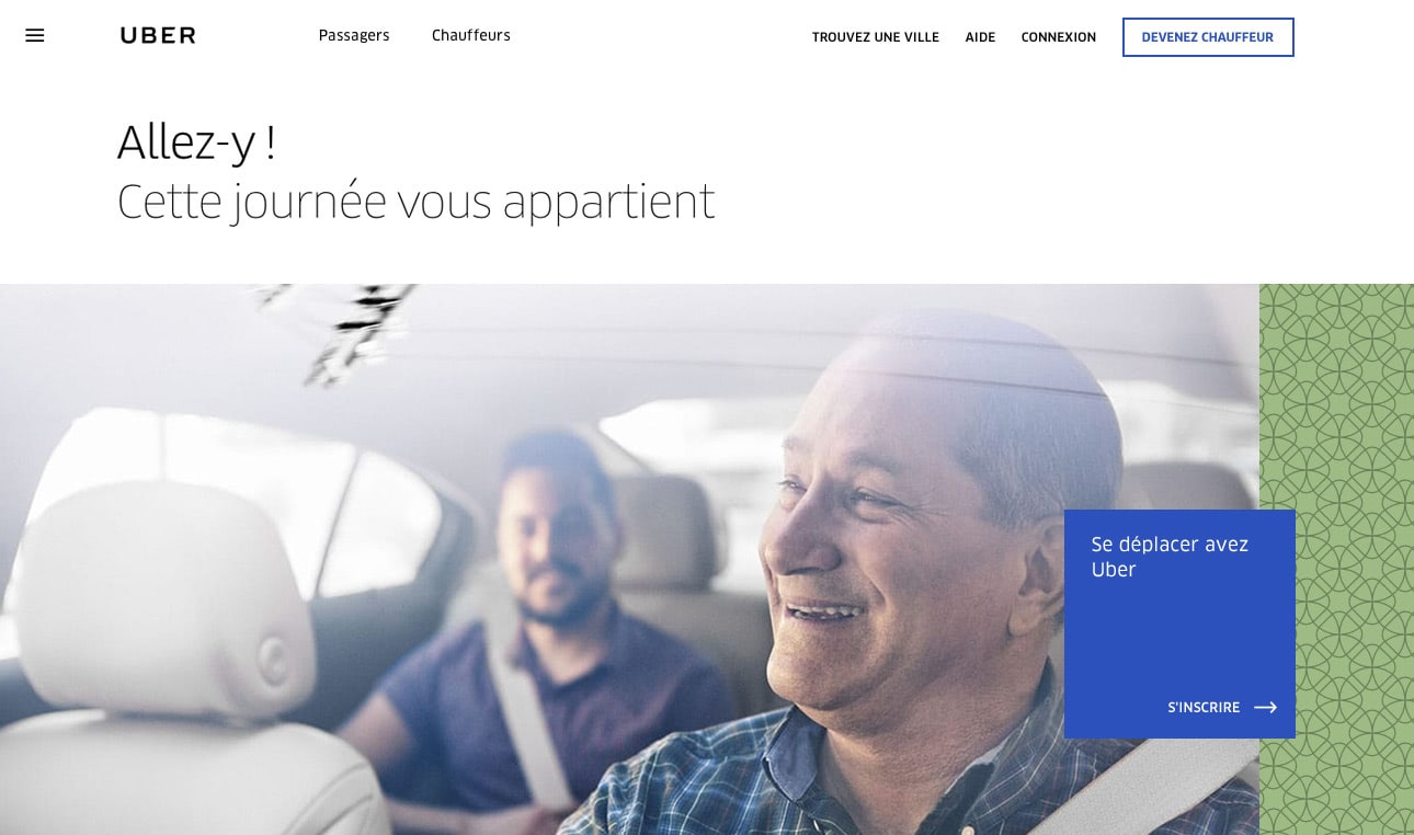
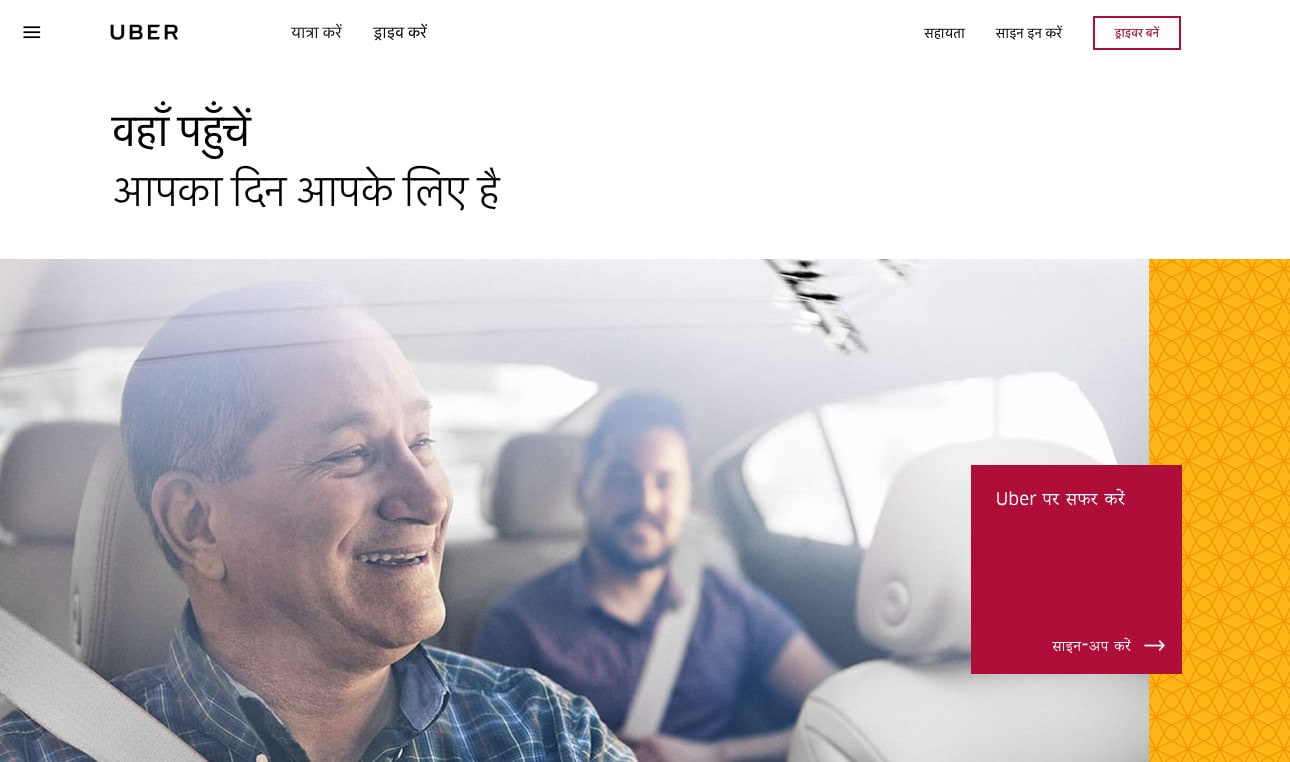
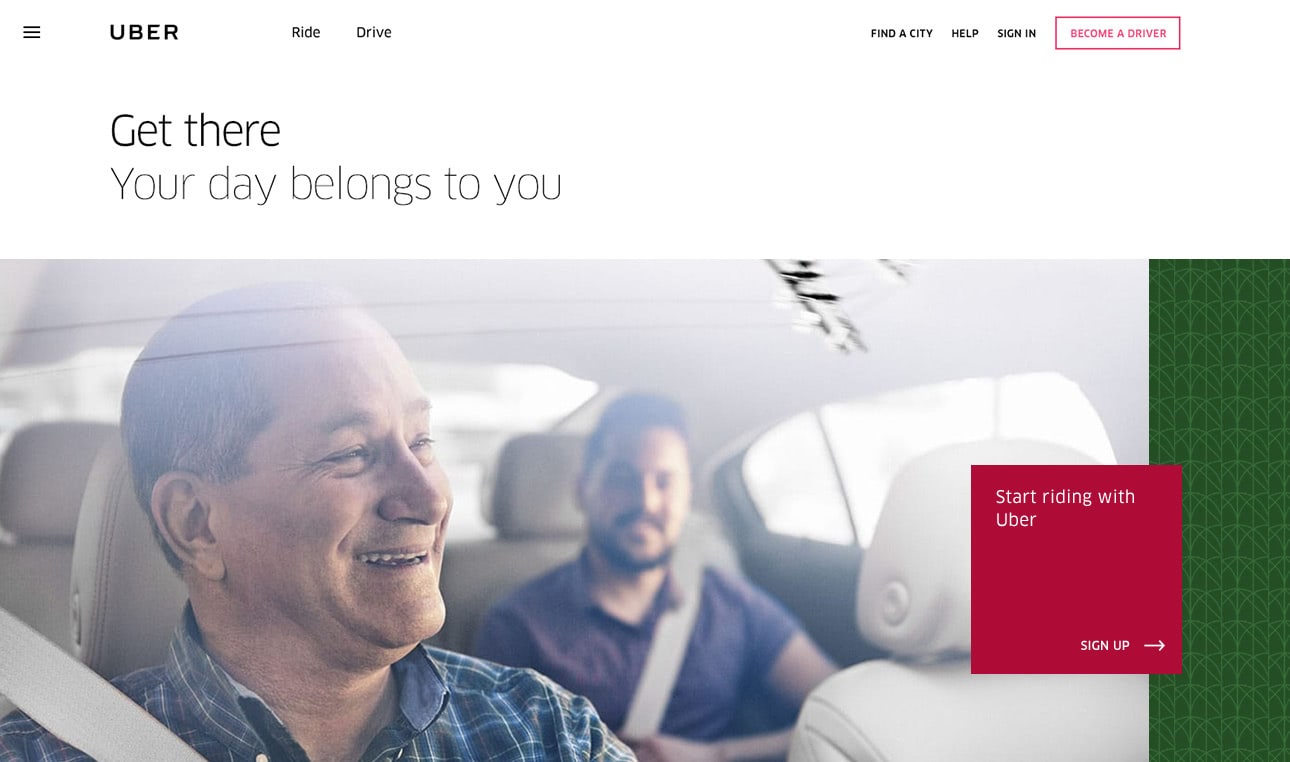
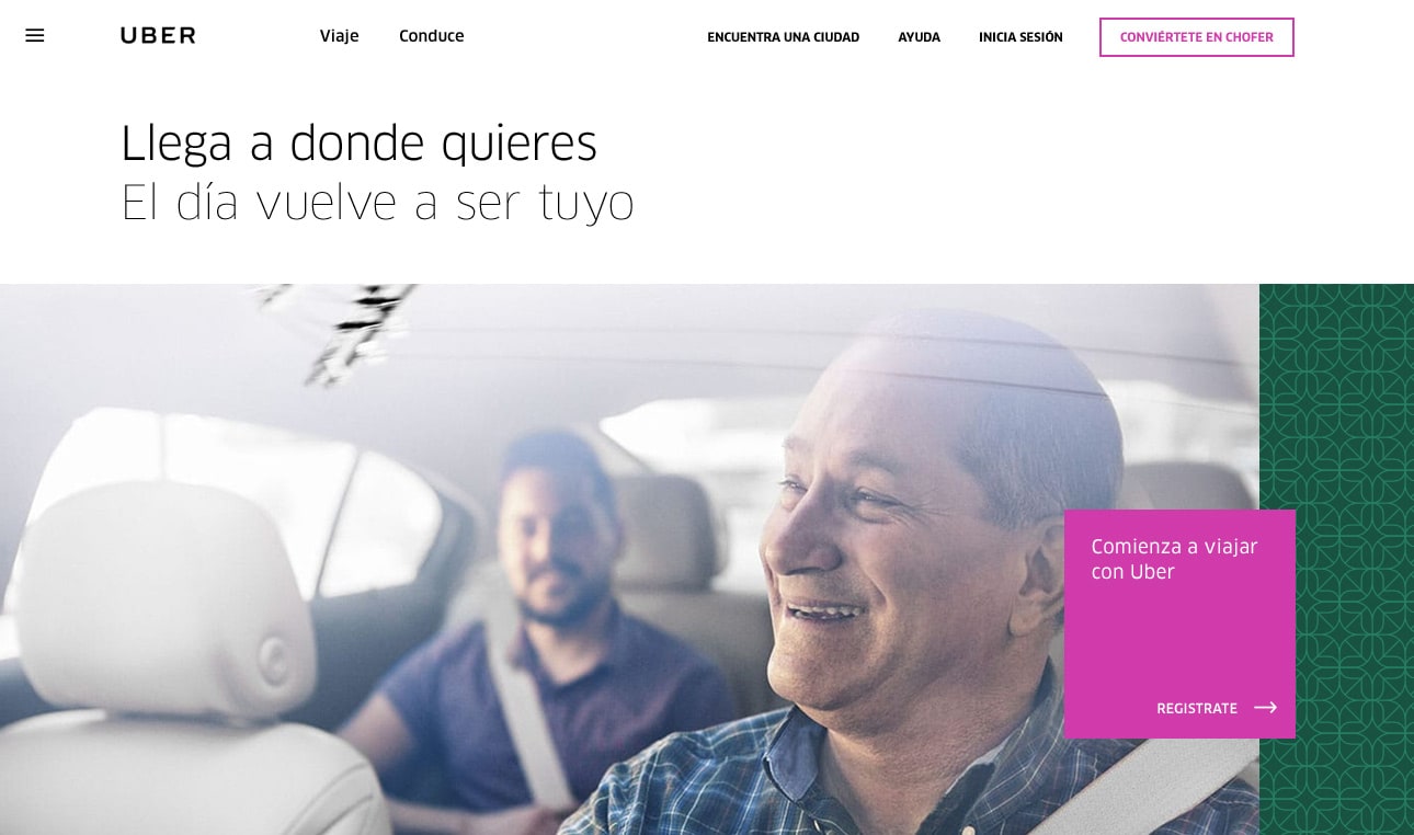
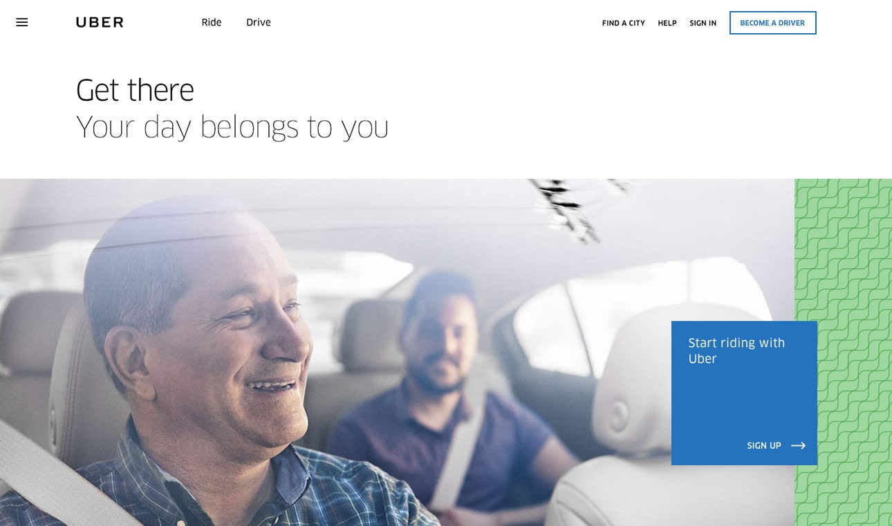
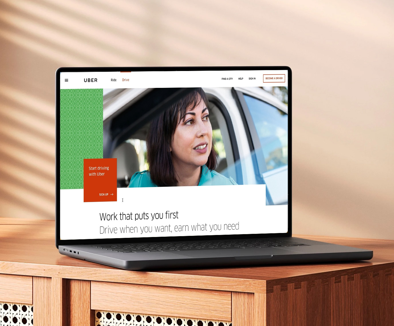
Helped redesign Uber’s global website alongside Ueno and Uber’s in-house design team — creating a friendlier digital presence and a flexible design system spanning thousands of pages.
Credits
- Creative Director
- Haraldur Thorleifsson
- Designers
- Ben Mingo, Robin Noguier, Jenny Johannesson and Anders Drage
- Illustrations and icons
- Stout Design
- Uber
- Shalin Amin and Strahan McMullen
- Project
- Uber
- Year
- 2015
- Role
- Designer
- Creative Director
- Haraldur Thorleifsson
- Designers
- Ben MingoRobin NoguierJenny Johannesson
- Illustrations and icons
- Stout Design
- Uber
- Shalin AminStrahan McMullen

The stories behind the work, in my own voice. A personal note if you'd like, with a few stories and detours along the way.
I was in San Francisco working with Lever, a recruiting company. A wonderful guy named Andreas had invited me over to help with their branding, and I was getting close to the end of my stay when I suddenly got a DM from Halli.
“Are you still in SF?”
Now, Halli — Haraldur Thorleifsson — is a living legend in the design world. Someone whose work I’d admired for a long time.
So when Halli asks, you show up.
I went over to his office, and within minutes I understood why he was so good. I ended up working with him and the team at Ueno for a couple of weeks on Uber’s global website. It was a short time, but it changed a lot for me — how I thought about design, business, and working with clients.
On Uber’s side, we worked with Shalin Amin and Strahan McMullen, both incredibly talented guys. Between them and the Ueno team, there was a lot to take in.
I remember having a meeting in the famous War Room, before it became famous. Funny to think back on that now.
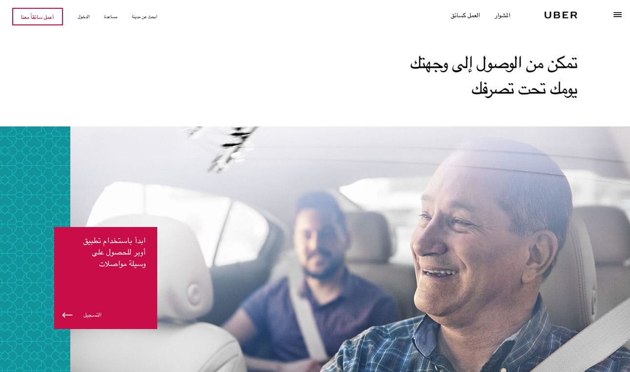
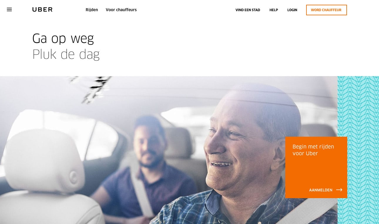
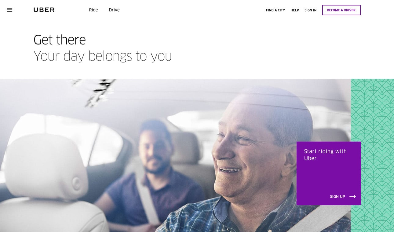
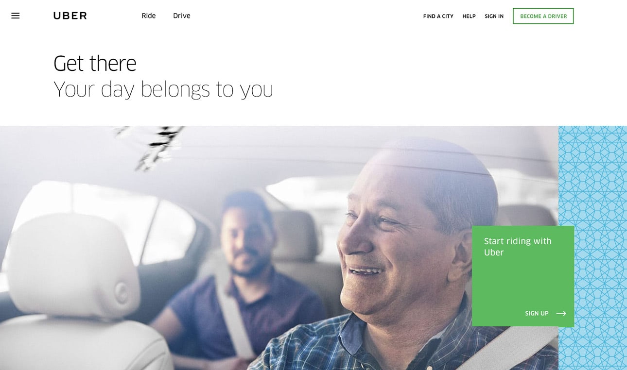
The project itself was about helping Uber move from an all-black world into something friendlier and more colorful. We were building a global design system, but every place needed room for its own character — through language, color, patterns, and Stout’s illustrations of cities around the world.
The scale of that work still amazes me. One system had to make sense across so many different places and languages. It was my first time designing for right-to-left reading, which was a fascinating challenge.
And I loved “the bit” — that little square that gave the main call to action a home. Such a simple thing, but always there to show you the way.
I’m really grateful that Halli brought me in and that the team trusted me. I learned so much in those few weeks. It’s one of those experiences that stays with you long after the project is finished.
We helped move Uber from all black to a friendlier, more colorful world, with a global design system full of local character. City pages came alive through language, color, patterns and Stout’s illustrations of cities around the world. The scale of that work still amazes me. It was my first time designing for right-to-left reading—a fascinating challenge. And I loved “the bit”: a little square that gave the main call to action a home, always there to show you the way.
A design system across borders
Explore how it looks locally